Porto — Portugal — World
Typographia Progresso Restaurant
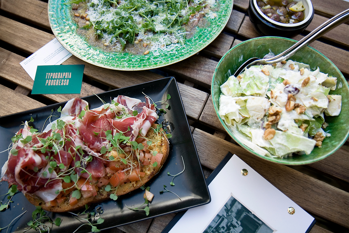
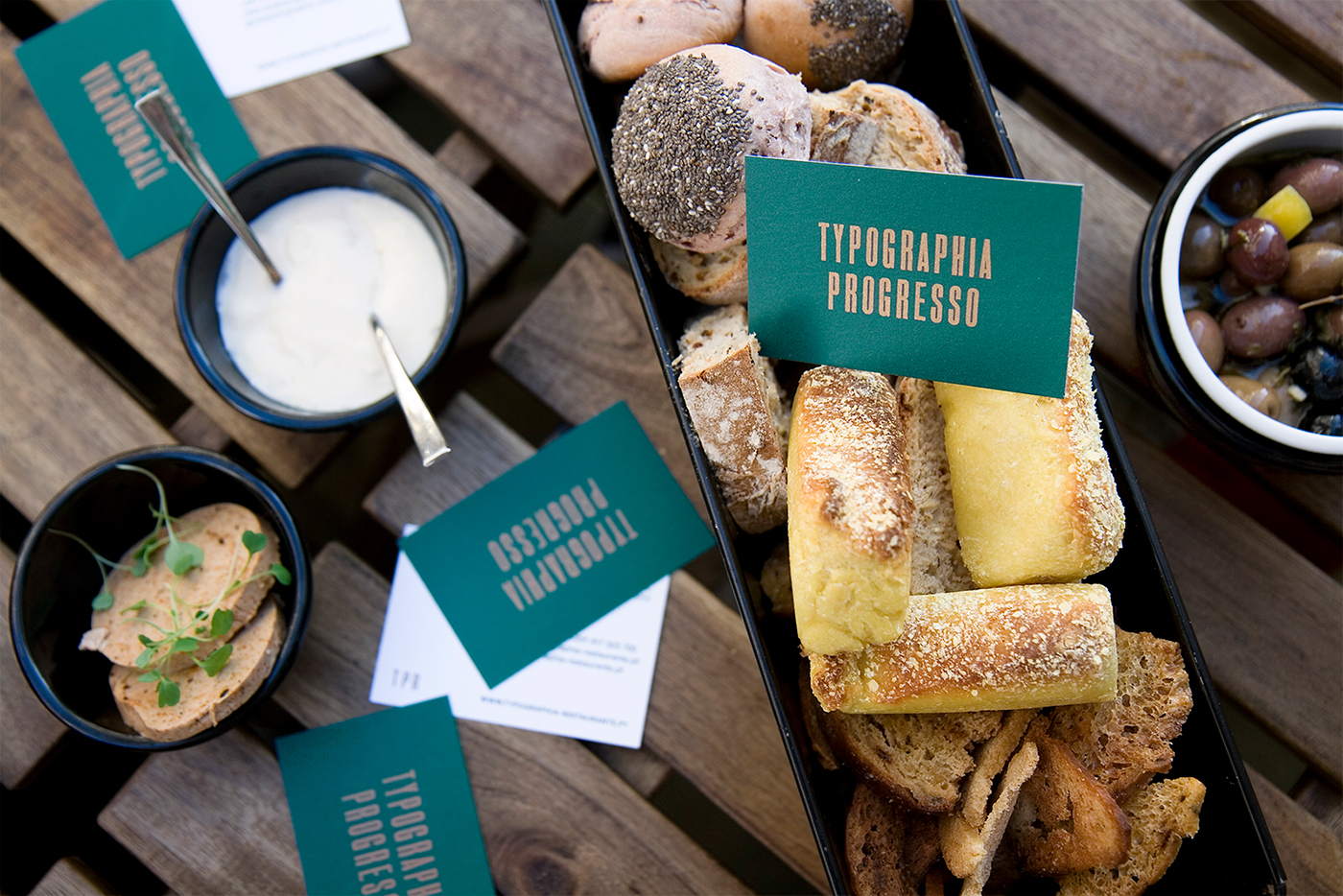
Under the wing of the renowned Chef Luis Américo, Typographia Progresso opened in late August 2017. Where there once was a former letterpress studio (whose name the restaurant decided to keep), there’s now a contemporary restaurant with a wine cellar, cheese & delicatessen store and a bakery. In a privileged space in the heart of the city, the menu goes from local to global, that is, from Porto to Portugal and from Portugal to the World (with a Portuguese touch).
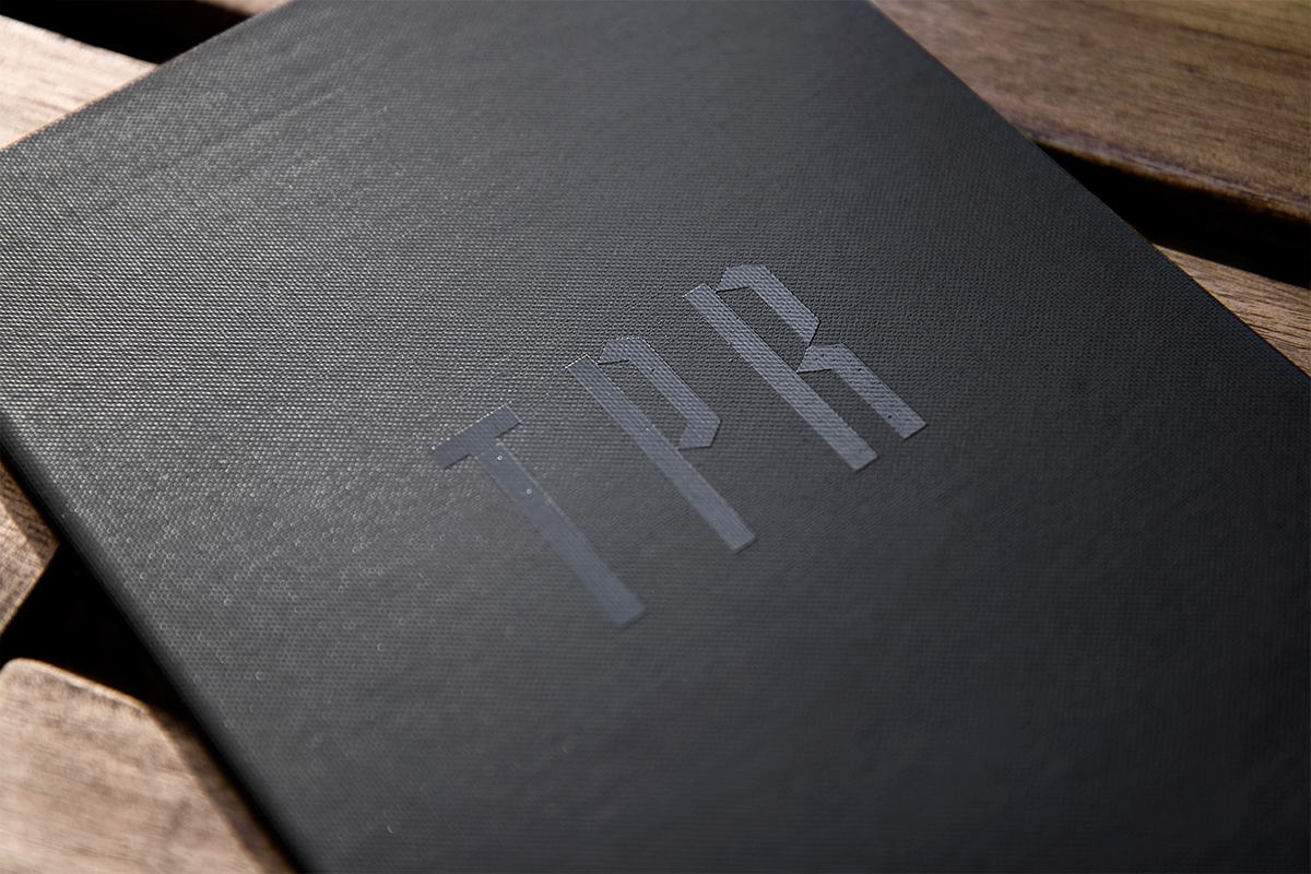
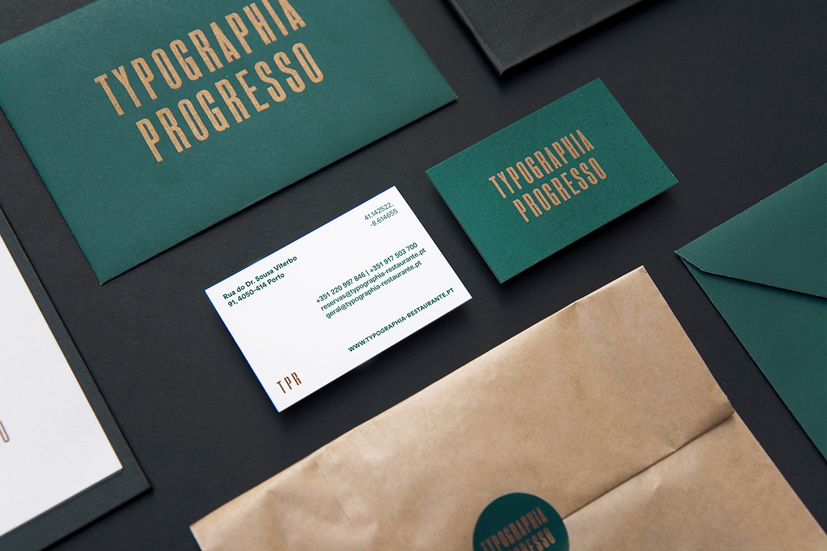
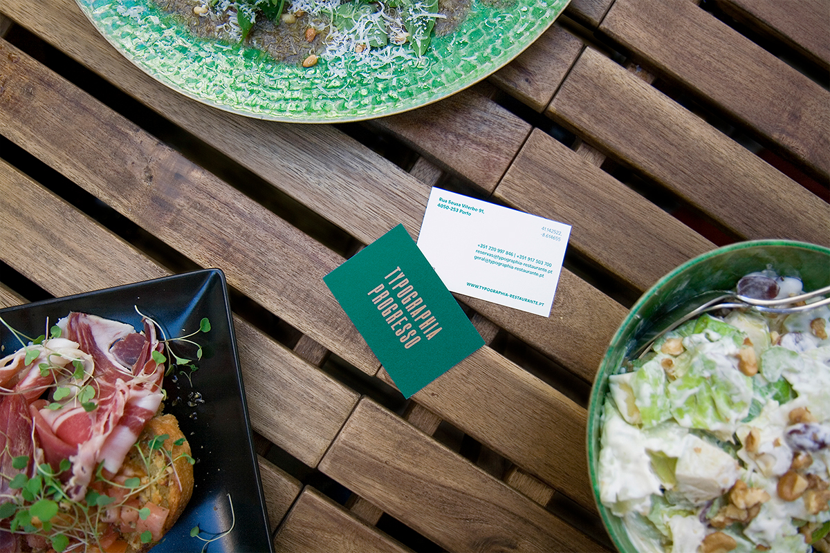
The graphic identity centres on several letterpress typographic compositions acknowledging the graphical heritage of the former place. The type that makes up the logo is bold and confident but contains subtle imperfections that hint at the unconventional nature of the venue. This concept is extended throughout the graphic applications, as the several menus designed with illustrations such as the world map that shows every country whose dish is on the menu.The color palette mirrors the sophisticated environment, with two old printing machines defining its ambience.
Overall the brand has been crafted with the intent of being both vintage but modern, a place whose craft the world may have forgotten, but the palate didn’t.
CLIENT
Typographia Progresso Restaurant
AREA
Branding, Web, Graphic Design
CREDITS:
PHOTOGRAPHY
Leonor Oliveira